
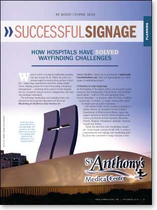
 When it comes to hospital wayfinding systems, one size doesn't fit all. While the goals of a system might be similar from facility to facility — improving organization outreach, easing family stress, helping patient flow and even aiding emergency management — achieving these goals is vitally dependent on a hospital's unique history, configuration, size and surrounding community.
The following wayfinding case examples were contributed by the hospitals themselves for the book Wayfinding for Healthcare: Best Practices for Today's Facilities, which can be purchased by clicking here. They are representative of a wide range of wayfinding projects.
Cohesion in any language
As the flagship of the largest public, not-for-profit health system in the Southeastern United States, Grady Memorial Hospital — built in 1958 and expanded every decade thereafter — is massive, with 953 beds, 2 million square feet, 22 stories, 11 wings, seven public elevator banks and six public entrances.
Like Atlanta itself, Grady's patient population is widely diverse. As identified by the system's Department of Multicultural Affairs, major languages spoken by Grady's limited English proficiency population include Spanish, Mandarin, French, Bengali, Vietnamese, Amharic, Russian, Somali and Arabic.
Under the direction of its wayfinding consultant, Grady began a project in fall 2006 to create a comprehensive new signage and wayfinding plan. The plan was conceived to bring cohesion to the hospital structure and, ultimately, to the system's ancillary buildings.
As the plan took shape, some key decisions were made: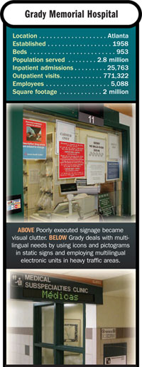
- The building would be subdivided into towers, named after the compass points; wing designations would keep their existing names.
- New signs would be color coded and include the Hablamos Juntos symbols. (The health system had helped to develop these symbols as a participant in the Hablamos Juntos/Society for Environmental Graphic Design (SEGD)/Robert Wood Johnson Foundation study to develop universal symbols for health care.)
- Elevator banks would be named by tower location, replacing a nonintuitive alphanumeric naming convention.
- The proposed system would be easy to maintain.
Starting in August 2007, Grady's emergency department served as a beta site, testing prototypes of the signs. A plan to move forward with permanent signage hospitalwide is in development.
In addition to meeting or exceeding Culturally and Linguistically Appropriate Services standards and Americans with Disabilities Act; Title VI; and other federal, local and accreditation mandates, the new signage system reflects Grady's ongoing efforts — including continuing collaboration with Hablamos Juntos and SEGD — to eliminate barriers to health care access and to encourage use of appropriate services for the diverse community population.
Cooperation yields results
Two highly regarded health care providers. One campus. In a nutshell, that is the problem that brought University Health Systems of Eastern Carolina (UHS) and East Carolina University (ECU) to its wayfinding consultant in 2008.
For more than 30 years, UHS's flagship hospital, Pitt County Memorial Hospital (PCMH), has shared a 100-acre parcel in Greenville, N.C., with ECU's Health Sciences Division. With 861 beds, PCMH, the teaching hospital for ECU's Brody School of Medicine, is the state's fifth largest hospital and home to the East Carolina Heart Institute at Pitt County Memorial Hospital. The ECU Health Sciences Division includes the Brody School of Medicine, the East Carolina Heart Institute at East Carolina University, the colleges of nursing and allied health sciences, and a new school of dentistry.
Throughout their 30-plus-year partnership, ECU and UHS have planned wayfinding independently, a system that has produced signage that advances each organization's distinct brand but gives the campus an inconsistent look. To serve patients and their families better, as well as physicians and medical students working in the Medical District, UHS and ECU agreed to jointly develop a master plan for campus wayfinding.
Integrating campus signage posed several challenges: preserve and strengthen each entity's brand, maintain cost efficiency and develop a scalable plan that could be tailored to the needs of individual buildings.
Other issues needed resolving, too: the lack of distinguishing signage on the Medical District's perimeter, outdated signage designs that featured building names more prominently than addresses, and the need to integrate with the city of Greenville's own wayfinding initiatives.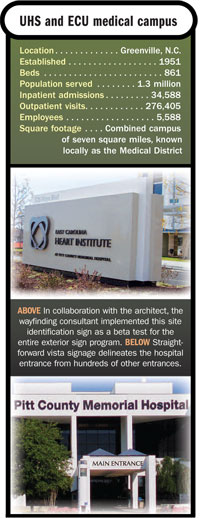
Further muddling the signage is the fact that, though the ECU Health Sciences Campus and PCMH each consist of several buildings, each organization uses a single, central address.
The wayfinding consultant helped UHS and ECU develop a design that lays the foundation for a phased, multiyear effort to integrate wayfinding across the medical campus. Details of the plan include the following:
- A standard sign design that, through its use of color, reinforces ECU's and UHS's respective brands. Teal will be the dominant color on UHS building signs, while ECU signs will feature purple.
- A higher profile for street addresses, which will occupy the top line on exterior building signage.
- Large brick cornerstones marking strategic entrances to the Medical District.
- Incorporation of the city's existing signage priorities.
- Guidelines for scaling plans up or down, making it easier to export plans to other UHS and ECU facilities.
- Preservation of each organization's current practices for the most local signs.
While full implementation of the plan will take several years, new and replacement signs already are reflecting its principles. In October 2008, UHS opened a new inpatient hospice facility. Signage there follows the consultant's design, as do placards at the new East Carolina Heart Institute at Pitt County Memorial Hospital.
Patron saint leads the way
After more than 100 years of service to the St. Louis metropolitan area, St. Anthony's Medical Center, St. Louis, was remaking itself. Changes in all facets of performance included a complete overhaul of signage and wayfinding dictated by patient complaints, lost visitor reports and visual inspection.
The goals were to create a visual hierarchy that brings signage in line with more contemporary standards; develop attractive, utilitarian signage that projects the organization's image; and improve patient satisfaction scores.
Plans were drawn up to start with the interior of the main hospital building, followed by implementation in off-site buildings and, ultimately, external signage both on and off the main campus. A newly remodeled first floor would serve as a pilot test site.
The wayfinding consultant decided to incorporate an award-winning signage system that had been used successfully in other organizations around the United States, incorporating St. Anthony's image on the major and most important directional signs. Adapting lessons learned from the pilot, the next phases incorporated the following features: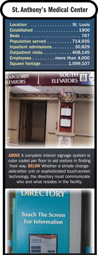
- Color-coordinated signage matching distinctive colors assigned to each floor;
- Large, wall-mounted floor numbers that included secondary directories in plain view of all elevators;
- A series of ceiling- and wall-mounted signs routing visitors from the parking lot to the correct entrances and elevators for the connected medical office building and to the main hospital lobby, and routing them from one facility to the next;
- Large, building-mounted and freestanding, off-site signs to direct attention to St. Anthony's three urgent care centers and to indicate where in those buildings physicians' offices were located;
- A large, building-mounted sign highlighting the new women's services component of a facility that also housed an outpatient surgery center, a senior center and physicians' offices, which were announced on a freestanding yard sign near the parking area entrance; and
- Topography modification, landscaping, and new identity sculptures and entrance portals to soften and define the entire campus, which had grown haphazardly over the years.
Over the course of about three years, the medical center completely renovated all interior signage and wayfinding in all its facilities and partially installed a newly designed exterior wayfinding concept. The program evolved into an entire streetscape redevelopment project, including landscaping, grading, new signage and large sculptural crosses.
All of the organization's objectives were met, including an increase in patient satisfaction scores with regard to patients' feelings of comfort, ease of getting around and overall impression of the facility.
Successful value engineering
In 2003, Rockdale Medical Center (RMC), Conyers, Ga., broke ground on its new East Tower, which would house multiple service lines and the main entrance of the facility, and changed its name from Rockdale Hospital and Health System to Rockdale Medical Center; a new logo also reflected the name change.
The two events warranted new exterior signage to guide patients and visitors to the correct entrance and relocated services, and a new interior signage system for the new tower.
The RMC signage committee included the chief operating officer; the director of marketing and strategic planning; the director of facilities; the construction project manager; a representative of the architectural firm hired for the project; and the facility's communications coordinator, who served as project leader. The committee hired a well-respected architectural signage firm and set about to name the hospital's five entrances, three of which were on the same side of the facility. Using a combination of compass points and service lines, they settled on North, South, East (the main entrance), Emergency and Day Surgery.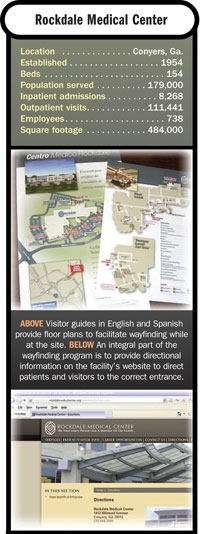
The marketing and physician relations departments undertook responsibility to educate local physicians' staffs on how to guide their patients to the correct location using new directional maps that were distributed to the physicians' offices and placed on the hospital's website.
The committee chose modular exterior signage to display the new entrance designations and an interior signage system that complemented the new tower's Planetree-inspired design. The result was aesthetically pleasing but, unfortunately, too expensive to use in the remainder of the facility as had been planned.
Once all the new construction was complete, RMC was faced with the dilemma of having five different interior signage systems, none of which was designed to allow for in-house maintenance. In 2006, RMC brought in a design consultant to perform a wayfinding needs survey and then develop an affordable sixth system that would complement the new one in the East Tower. The solution was card stock inserts that could be updated easily by RMC staff using existing software and laser printers, allowing changes to be made in minutes instead of weeks. This new system is being used for all new projects and to replace existing signage throughout the facility.
Address system comes to rescue
The main campus of the Iowa Health System's The Finley Hospital in Dubuque, includes the hospital, Wendt Regional Cancer Center and a medical office building, all of which are interconnected.
Over the years, the hospital's signage system had been neglected. No one person was responsible for signage — each department and area was posting its own; and no numbering system was in place for rooms other than patient rooms.
After five additions over the previous 50 years, finding one's way around the hospital was problematic; indeed, wayfinding was one of the top complaints on patient surveys.
Once approval was received to proceed with a wayfinding and signage study, a search was conducted and a consulting firm selected to perform the work. Its charge was to evaluate the current situation and develop recommendations for improving the wayfinding at Finley, including helping to create a room-numbering system for the hospital.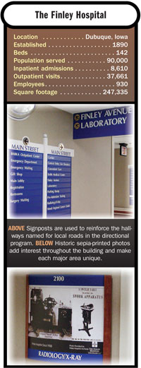
Following interviews with administration, managers, employees, patients and visitors, the consultant recommended a wayfinding and numbering system based on a city street and address concept, as follows:
- Corridors were given the names of well-known streets in Dubuque.
- Departments were given a street address and numbers.
- Signage for departments and directional signs were put in place to resemble local street signs.
- Department marker signs at entrances feature historical pictures of The Finley Hospital and its various departments.
- A scrolling digital electronic sign tells patients visiting the multi-use clinic on the third floor which type of clinic is being held that day.The sign is changed easily each day by clinic staff using a remote control device.
The results were immediate. The number of wayfinding complaints from patients and visitors has dropped virtually to zero. In fact, the hospital has received many compliments on the look and effectiveness of the new signs and directories. Identification of rooms and offices throughout the building has enhanced both life safety and energy management systems.
Randy Cooper, SEGD, is an award-winning designer, a nationally recognized author and speaker, and the owner and president of Cooper Sign & Graphics, Atlanta. This article is excerpted from his book Wayfinding for Healthcare: Best Practices for Today's Facilities, which can be purchased at www.HealthForumOnlineStore.com. Cooper can be reached via his e-mail address atrcooper@signsystems.com.