 |
|
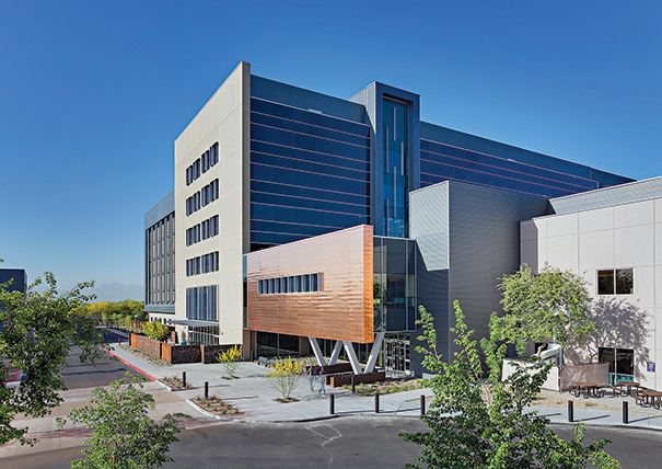
PHOTO BY LIAM FREDERICK A large vertical glass feature, called a “waterfall,” marks the Banner Health brand and contrasts with the concrete exterior used in the template design at this Banner Estrella Medical Center expansion in Phoenix. |
Health care facilities not only provide the setting for delivering care to a community, they also serve as the representation of an organization’s brand promise to that community. This promise goes beyond the use of logos and colors for identification. The design of a health care building has the potential to create a distinct brand identity.
More and more, health systems are redefining brands to encourage wellness and healthier behavior. As systems rebrand themselves as avatars of wellness, designs must respond to this goal in physical form. Design features that emphasize wellness, like walking paths and demonstration kitchens, aren’t just programmatic add-ons, but are integral to a system’s brand message.
You may also like |
| Retail design strategies for health care |
| Health facility design survey |
| Planning public health care spaces |
| |
By using the designer’s palette of tools, such as form, lighting and color, and adopting strategies like template design solutions and retail models, health care organizations can have greater impact on the consumer psyche. Capturing larger market share, increasing consumer retention and enhancing staff recruitment efforts are often cited as benefits of using design to help define a brand.
Ultimately, the quality of care an institution provides drives repeat business, but it is the brand that today’s consumer patients relate to when making decisions about their care. The building design can become the physical embodiment of a health care organization and can foster brand loyalty.
Image and design
To most consumers, health care organizations are represented by buildings. People identify their health care providers with the local hospital in many communities. The physical presence of the hospital building or medical campus is central to their perceptions of the provider’s brand — building and campus design imply quality and exemplify a philosophy of care.
Accordingly, designs should be linked to an organization’s brand image. Features like integrated staircases, libraries, health food venues, natural light, fitness centers, farmers markets, community gardens and outdoor rooms demonstrate a wellness approach to health care, while outdated buildings can give the impression of outdated care models. An organization that isn’t investing in its physical environment may raise questions in consumers’ minds about the organization’s investment in other aspects of caregiving.
Consumerism is a large part of current reimbursement strategies. People can go online to evaluate outcomes and make more informed health care choices. But perception is still crucial to why people choose one provider over another. The appearance of facilities has an impact on decision-making. Together, high-quality care and a brand image inspire consumer loyalty.
People who have a good experience at a facility become loyal customers themselves and share their experience with family and friends, allowing that positive brand image to facilitate the acquisition of increased market share. For health systems with multiple buildings, specifically designed facilities that reinforce the provider’s brand emphasize consistency and a common level of quality at each location. Organizations like Banner Health, Phoenix; Kaiser Permanente, Oakland, Calif.; and the MetroHealth System, Cleveland; are utilizing the design of their facilities to capture new markets by identifying their buildings with their brand.
Systems that have developed through acquisitions of existing facilities can help to establish a consumer perspective of consistency and high quality by making some basic moves to create a uniform appearance. Ironwood Cancer & Research Centers, Glendale, Ariz., for example, is a repurposed industrial building. The building now incorporates the design, materials and colors associated with the organization’s brand, such as an architectural metal-clad form that frames the entrance, brightened by Ironwood’s signature yellow.
A consistent brand image can increase consumer retention by bolstering people’s confidence that they’ll receive high-quality care across the board from a health care organization. Visual cues stimulate people to remember experiences. Establishing a connection between a building and a health care organization prompts consumers to associate the building with previous positive experiences. In today’s mobile society, visual representations of a brand can be especially valuable in helping consumers to recognize a familiar and trusted health provider wherever they may be.
Wellness-focused designs help to integrate health care organizations into consumers’ lives by making it clear that the organization provides a full continuum of care, from maintaining and improving health to overcoming or managing injury or illness.
Positive brand images also influence staff retention. Just like consumers, staff members appreciate buildings that project quality and reinforce healthy messages. From a programming standpoint, strong branding provides a consistent solution to operational issues, allowing staff members to work well and efficiently in any number of buildings within a health system.
The use of templates to establish and reinforce brand messages provides aesthetic and operational consistency. Template programs are based on health systems’ unique operational models. These aren’t one-size-fits-all solutions but individual models, each designed to meet the requirements of a specific organization.
By understanding an organization’s operational model, designers are able to develop planning components that can be interchanged as needed while maintaining that operational basis. For example, the design of an outpatient clinical module would be based on how a particular health care organization delivers this type of care. The module could be built around four physicians and the staff and space they need for primary care. This clinical module then could be replicated in as many units as necessary to meet the needs of a community or demographic area. The module also could be adjusted for specialties like pediatrics, cardiology, neurology or behavioral health with little modification. Because the module is based on the operational model and expected patient and staff experience, these will remain consistent wherever the module is deployed within a system.
Design elements
Design elements are architectural tools used to define a space. These are the aesthetic components that go along with programmatic design to signify a building belongs to a specific organization. Elements include form, volume and scale; lighting; graphics and color; materiality and texture; art and furnishings.
Other aspects of building design are generally located behind walls or above ceilings and are not easily perceived. The design elements that really define a brand are those that people can touch and see. Used in combination with one another, they are able to portray a unique setting.
The form and scale of a building can make it stand out. Representative forms are easily recognizable against a skyline. While it may seem logical to build one-story facilities with larger footprints where land is inexpensive, it can make more sense to play with scale and create two-story volumes to develop some of the iconic elements that define a brand. In addition, larger internal volumes can define public areas vs. more intimate clinical areas.
The MetroHealth System is using these principles in a template design for outpatient facilities in the Cleveland metropolitan area. The health system traditionally has been seen in its region as a county facility located on a single, concentrated urban medical campus. As part of an effort to expand its brand and reach out into the community, MetroHealth developed the outpatient facility template design. This design, used initially at the November Family Health Center in Middleburg Heights, Ohio, is intended to emphasize the health system’s relationship to the community.
The scale of the building is intentionally wide, for a strong street presence. The form is punctuated by multistory glass walls at the entrance to the building that are meant to provide a sense of transparency and demonstrate the health system’s openness to the community. At night, the glass creates a lantern effect. This makes the building more visible and gives it a warm and inviting appearance in the late afternoon and evening hours. During the day, the glass brings in natural light. The quality of light in the Cleveland area is diffuse, allowing for the generous use of natural light in interior spaces. This connects the facility’s interiors to the outside world.
Lighting is key to transforming a building, day or night. How light interplays with shadows and space defines architecture. Light can be used to emphasize texture and massing on a building’s exterior. As demonstrated in the MetroHealth design, light serves as a welcoming element in the evening. Lighting a department like urgent care, which typically sees peak volumes in the early evening, brightens the lobby space to attract people’s attention and make them feel welcome.
Lighting also can be used to emphasize other design elements associated with a health care brand, like color. The yellow entrance to Ironwood Cancer & Research Centers’ Glendale facility is emphasized with outdoor lighting. The dramatically lit yellow stands out against the darkening evening sky.
Natural light is also a key design element. Many studies have shown how important a connection with nature is to people’s well-being. To understand their place in time, people need to be able to have a sense of what’s happening in the outside world. Interior spaces such as exam rooms or waiting areas with no outside windows can disorient people about the passage of time. Incorporating daylight into these spaces supports a connection to time and to nature, in accordance with a wellness-focused health care brand.
Color and integrated graphics are used in health care design to aid in wayfinding, especially in complex inpatient facilities. These elements can reinforce a brand image by referencing the color or design of a hospital or health system’s logo. A logo with a natural element, such as a leaf, can be a jumping off point for graphics incorporated into flooring or wall design to identify different departments — for instance, a wall of maple leaves for radiology and a wall of oak leaves for pediatrics. Banner Health uses translucent panels with images of natural elements to help distinguish each floor of the health system’s facilities. The graphics become part of the architecture and the décor.
In the MetroHealth outpatient facility template design, the vertical lines of the health system’s logo (an intertwined capital M and capital H in two shades of blue) are abstracted as blue metal mullion extensions on the building’s exterior. These details add color and interest to the building while referencing the MetroHealth brand.
There are a number of materials at designers’ disposal that can be used to establish iconic brand elements. Materials like glass block, concrete, brick, stucco, wood and metal all can contribute to a signature appearance. Banner Health’s template design also helps to reinforce the organization’s brand [see sidebar, Page 27].
Certain materials are evocative of certain brand images. Wood can give interiors a warm, homey feel, well-suited to environments like senior living facilities where the brand image is residential. Facilities that wish to project a more high-tech brand may choose materials like stainless steel. At MetroHealth, metal panels are used in conjunction with white and light-colored materials for an almost futuristic look, in support of the organization’s new image in its community as a progressive, technologically advanced health care provider.
Art and furniture are not simply decorative features; when carefully curated, these elements can significantly reinforce a brand by creating an environment in keeping with the brand image. An art program, for example, can utilize the work of local artists to strengthen the health care organization’s connection with the community. Programs like art shows in the lobby, where local artists’ works are displayed or even offered for sale to the public, can draw people to the facility on a regular basis. MetroHealth worked with a local artist to incorporate photographs of the community into its facilities, to recognize and celebrate the region and emphasize its ties to the MetroHealth brand. At Golden Gate Urgent Care’s Civic Center location in San Francisco, which is adjacent to a major bicycle commuter path, the organization plans to install a bicycle-themed mural along a long corridor. Artwork can also highlight a brand through form and color — commissioned art pieces might play up the hospital or health system’s logo, for example.
Mark of quality
Buildings that represent a brand are a powerful part of the corporate world. As health care transitions to a more consumer model of care, hospitals and health systems can learn a lot about utilizing design as part of a strong branding program.
An effective brand is a mark of quality that communicates the core values of an organization. There are many opportunities to integrate branding into the design of health facilities, making a provider’s buildings and philosophy of care immediately recognizable to its consumers.
Mark Patterson, AIA, ACHA, EDAC, LEED AP BD+C, is corporate health practice leader and vice president for SmithGroupJJR in Phoenix. He can be reached at mark.patterson@smithgroupjjr.com.
Template provides system with consistent characteristics
Phoenix-based Banner Health system has championed the use of template design to establish a consistent approach to all of its new and renovated facilities.
The system operates 23 hospitals and specialized health facilities in Alaska, Arizona, California, Colorado, Nebraska, Nevada and Wyoming. Banner Health has leveraged the template approach to create an iconic solution for each of its buildings. The template design clearly identifies each facility as part of the Banner Health system while honoring the specific locale in which it is implemented. This is facilitated through the use of materials.
Banner Health facilities are clad in concrete masonry units that have a textured appearance and are patterned to resemble Native American beadwork or tapestry, or the sedimentary rock of canyon walls. Similar block patterns are utilized in the design of the facilities’ interior spaces, such as lobbies. The pattern and color change somewhat from location to location within the Banner Health system, to fit with the local environment and community.
At each facility, the concrete exterior is juxtaposed by a large vertical glass element known as the “waterfall.” The waterfall is a signature brand element used to identify Banner Health facilities, even from a distance. It serves as a wayfinding feature within each building and helps to define specific locations, typically the main entrance.
The template offers the health system a standard yet flexible operational solution that can be applied across many facilities, as well as a standard yet flexible aesthetic. Both factors are important in establishing a brand image.
Prototype clinic extends brand throughout local community
Golden Gate Urgent Care operates multiple accredited urgent care facilities in San Francisco and the surrounding area. The health system has taken a retail approach to branding its facilities to attract people’s attention at the street level in a dense, urban environment.
The system’s Lombard Street clinic was developed as a prototype for additional clinics installed in retail districts. The design is intended to be bold yet simple, to provide high visual impact and project an image of efficient and compassionate care.
Each location is designed to be readily apparent on the street. Large, storefront-type windows showcase a bright, sophisticated color palette inspired by the orange hue of the Golden Gate Bridge and the blue of the San Francisco Bay. Lighting is designed to accent these colors and create an inviting space for patients and staff. The bright, warmly lit spaces are meant to stand out particularly in the evening hours, when people most often require urgent care services.
Each lobby has a characteristic design element, such as a curved wall, high ceilings or interesting furnishings, light fixtures or artwork. At the Civic Center clinic, for example, custom light-emitting diode fixtures up to 7 feet in diameter highlight the point where three major San Francisco avenues meet.
Golden Gate Urgent Care plans to install a bicycle-themed mural along a corridor at the Civic Center location, which is adjacent to a major bicycle commuter path. Features like these are eye-catching and help to demonstrate how the Golden Gate Urgent Care brand is connected to the region and the people who live there.