Natural light brings the outdoors inside, while finishes have a depth of color that does not create glare.
Some of the most successful health care interiors visually relate to the surrounding natural environments. This helps health care facilities to reinforce strong connections with their communities.
By taking design cues from local scenery, geographic elements and panoramic vistas, designers can deliver projects that will feel more comfortable, function better and work with mind, body and spirit to promote well-being.
You may also like |
| Researched solutions for health care interiors |
| Color and health care lighting |
| Artwork’s role in four hospital projects |
|
|
Health care interior designers are an integral part of a project team that can create a comprehensive, balanced, holistic design through concepts found in nature in the local region. The results can be supportive spaces that nurture occupants and provide comfort.
Cues from nature
Everything from flooring materials and wall coverings to fabrics, laminates, lighting and furniture can be referred to as healing but it’s important to look beyond individual details and singular solutions. The most appropriate solutions for complex medical environments will take cues from the exterior environment in a holistic and inclusive way with lighting, color and textural elements.
As time goes on, buildings change, designs evolve and new materials are developed. Details matter and simplicity can be refreshing, but health care interiors should take a broader approach rather than focusing on specific items to provide a positive impact.
With much research showing improved well-being by connecting with nature, it makes sense for the interior design to include and emulate aspects of nature, especially those indigenous to the project location. It is not about the color of one lake or a single stone outcropping, but a general representation of regional elements. The goal is to capture a range of colors, tones, textures and shapes — in the variety of natural elements that represent the community. When done properly, the human mind, body and spirit instinctively respond in a positive way.
Typically, architects and interior designers create a series of concepts to help owners, medical staff and stakeholders understand the proposed project direction. If nature is to be the source of inspiration, specific design concepts are crafted after becoming familiar with the areas, landscape and geographic features that surround the project site.
With photo images in hand, the concepts can serve as specific inspiration for the project design. Presentations delivered to key staff members and stakeholders early in the project-visioning stage will help them to understand how indigenous images of nature will be used to convey guiding principles for design. The presentation should be done as project visioning begins and prior to project planning and material selection. The document may serve as a reference all the way through to final design decisions. It will support the design direction, including proposed materials, colors and textures.
Interior concepts and material applications should be supported by the images. This provides tangible principles that resonate with people. Stakeholders are able to understand how the proposed colors and materials were derived and why they feel comfortable with them. Another benefit of creating guiding principles for design is that it removes personal color preferences from the equation. It creates an organic design that is contextual and in harmony with the geographical location and the tastes of the people in that region.
Lighting the way
Most people would agree that they feel better on a bright, sunny day versus one with gray clouds overhead. Research shows that the human body and brain respond to natural light in a positive way.
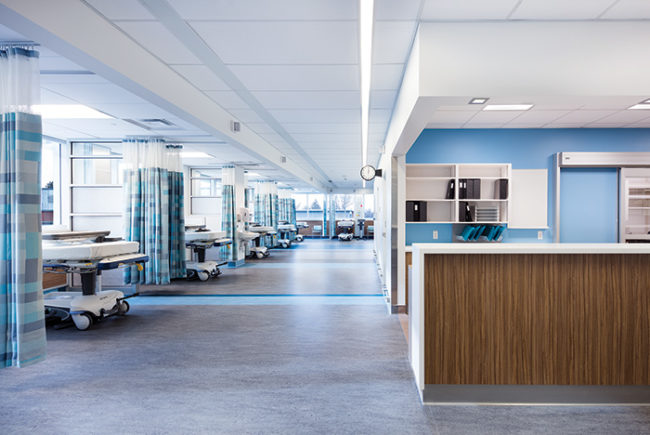
Studies have yet to prove any health correlation with artificial lighting but, when designed properly, it still has a positive impact. Ceilings in health care facilities should be light in color and bright in lumens. Various types of indirect lighting can create ceilings that glow with optimism. Dark ceilings, on the other hand, often can have the opposite effect on individuals.
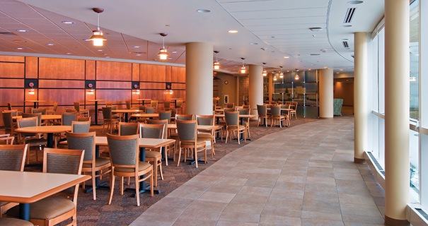
Health care environments should reserve dark ceilings for select spaces where the patients and visitors do not spend a great deal of time. A small café or gift shop are good examples. These spaces usually have a large number of colorful positive distractions to lift spirits. For the majority of hospital and medical center areas that are occupied by patients, visitors and staff for extended periods, however, a luminous ceiling is a better option.
Lighting levels also can assist with wayfinding in health care facilities. Humans, animals and plants instinctively move toward the light. This biological response may be hardwired as a means of self-preservation. Consequently, interior designers may consider higher levels of illumination at critical access points and circulation routes.
This may reduce stress by improving the ease with which decision-making occurs in a complicated maze of hallways. Many patients and visitors traversing large medical centers already may have physical impairments or cognitive disabilities. Combine those issues with added stressors caused by the facility itself and it could lead to confusion and unpleasant experiences.
Elevator lobbies, exit stairs and main corridors should be illuminated more brightly than adjacent units or patient care areas to give wayfinding cues. Often, staff-only patient transport hallways are much more brightly illuminated than other halls, but also will include signage to deter casual traffic.
Another way this concept can be incorporated into interior planning and design is through the use of exterior windows. Exterior windows should be included wherever possible for obvious reasons and health benefits; however, consideration sometimes is not given due to first costs or because the space is needed for other purposes. The inclusion of windows within a long hallway or at the end of a corridor provides beneficial natural light as well as natural views during daytime hours.
Large medical centers can help to orient individuals with their location on campus through windows that provide views of landmarks, buildings, parking and gardens. Patients and visitors frequently get lost in the complicated maze of endless hallways, but often will remember locations where the light provided additional assistance with wayfinding.
Finally, it’s also important to understand some of the ways that light can be detrimental to the health and well-being of occupants. Light-colored, highly polished flooring should be avoided. These floors reflect light from downlights in the ceiling as well as incoming light from exterior windows. Often, the result is glare so harsh that it reduces the ability to see clearly and also causes undue stress on physiological systems. Additionally, glare can cause eyestrain, headaches and fatigue.
Another concern is building entrances and lobbies. Individuals entering health care facilities from outside on a bright day often will find a dramatic decrease in the lighting levels. The problem is that until the eye adjusts, it is uncomfortable, stressful and possibly even dangerous due to the potential for slips and falls.
This issue is not only a concern for seniors with impaired vision, but also a common occurrence for adults with good vision, because the aging eye does not react to changes in light levels and adjust as quickly as it once did. The most effective way to prevent this from happening is to ensure that entry areas have high illumination levels.
Using a combination of indirect artificial lighting along with exterior windows to provide plenty of natural light during the day is the best solution.
Colorful considerations
It is important to create an interior environment that captures our interest, stimulates the senses and provides positive distractions. Color should be considered an important part of the solution.
Color always has been a vital ingredient in facilities that care for children, but only recently has evidence shown that the application of color is equally important for people of all ages. Young adults, middle-aged people and seniors all benefit from the broad use of color applied to interiors.
Studies suggest that some of the best environments for health and healing incorporate a variety of hues, use both warm and cool tones, and vary color saturation. In the past, monochromatic color schemes were thought to be the most soothing. However, one-dimensional color schemes have been found to be bland and uninspiring in many medical environments.
Combinations of color can be found in the local scenery and settings near projects. Designers should look at the variety of color tints, tones and shades painted across local landscapes. They should think about an intense orange sunset above a cool blue lake or a green tree punctuated with spring blooms of color. As in nature, the colors need not match, but should work well together.
Designers also need to include elements that create a high degree of contrast. This creates spaces that are more visually stimulating and aids individuals with visual impairment. Throughout the facility, it is important to include a variety of different colors for a balanced approach in creating an aesthetically pleasing environment.
Residential interior designers often keep color and contrast in mind while developing their designs. But, for some reason, commercial designers don’t always give the same consideration to contrast in health care interiors. Perhaps the abundance of code-required equipment, controls and devices prompts architects and design teams to favor a more monochromatic design scheme. However, the absence of color and contrast actually may cause those same medical elements to appear even more prominently.
When designers include color and contrast, those less desirable elements often become less noticeable. Think about the contrast found in natural surroundings. For example, a row of trees with dark bark in front of a pale wheat field; bright stone outcroppings protruding from a lush, green hillside; or brilliant white clouds upon a vivid blue sky. Similar images can provide positive distractions from the stress patients and caregivers experience.
Health care designers should use a variety of color, textures and tones to offer the needed contrast within clinics, senior living communities and hospitals. Strong differentiation in color value and tone can assist with wayfinding, aid those with visual impairments and provide a more lively, upbeat interior.
Contrast is important between seating and floor for the sight impaired as well as between sink or countertop and floor, or toilet and floor. However, designers should use strong contrast on the floors with caution in some areas. Individuals with dementia or visual problems can mistake strong contrast for a step or a hole in the floor.
A grip on textures
Another important design element that helps to bring local nature into health care spaces is texture. While this has applications for furnishings and casework, wall coverings and art installations, the most frequently discussed product in this area is flooring.
People of all ages and abilities feel more comfortable when walking on firm ground with good traction. Flooring in a medium or medium dark color and tone is preferred in health care settings. The floors should not be extremely light, bright or white. The surface should not have a highly polished, glossy finish or a high sheen nor be slick underfoot.
It was once common for medical staff to request a high-gloss wax finish, even on low-maintenance floors that required no wax. This was because many medical staff believed the floor was only clean when a high-gloss finish existed. Their perception of clean actually conflicted with the comfort and well-being of occupants. Flooring materials that are slick, highly reflective or create glare have the potential for slips and falls.
For many areas within medical facilities, resilient floor materials may be required by code or preferred for maintenance reasons. For these areas, a product with a matte finish is a good solution. Additionally, it’s beneficial to select resilient products for other reasons. Wood-look sheet vinyl has been popular for many years. Some of the best have a subtle surface texture, which provides aesthetic and functional benefits. The embossed texture adds to the slip-resistance by preventing shoes from hydroplaning in the event of liquid spills. Using a variety of resilient floor products adds interest to the interior. Many resilient products are available in a variety of colors and patterns inspired by nature.
Carpet is a good flooring choice as well. It provides excellent traction, no glare and no risk of slipping, and the fear of falling is reduced. Carpet benefits staff, too, by helping to minimize foot fatigue. It also reduces and absorbs ambient noise, another reason why carpet is specified often for corridors and hallways.
However, it’s important to remember that corridor carpets should not include padding or a cushion-back because it makes wheeled traffic difficult. Also, level-loop construction should be used for health care and senior living facilities. Studies suggest that some individuals have increased risk of trips and falls in areas where carpet has a noticeable surface texture.
The materials selected for floors and other surfaces can’t have an adverse effect on the users. Proper floor choices will reduce the risk of slips and falls, visual fatigue and create a comfortable environment.
Benefits of nature
A health care interior design project covers many different products, details and solutions, from furnishings and lighting to flooring, wall treatments and beyond. By applying these principles to lighting, color and textures, a designer can successfully use these elements to bring the benefits of nature into a health care facility.
Sheila Semrou, AAHID, ASID, is principal at Sheila Semrou Consulting LLC, Milwaukee. She can be reached at ssemrou@milwpc.com.