
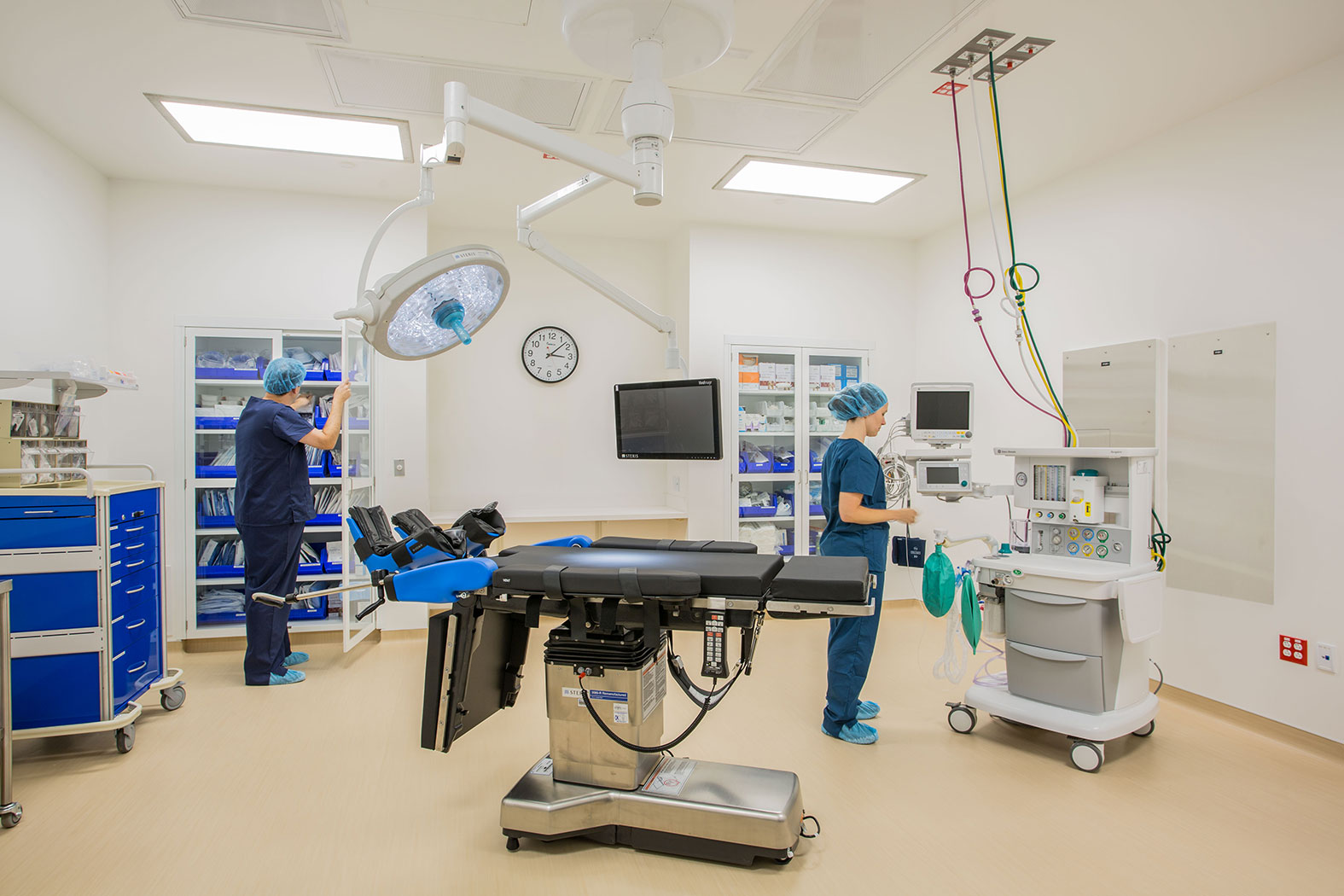
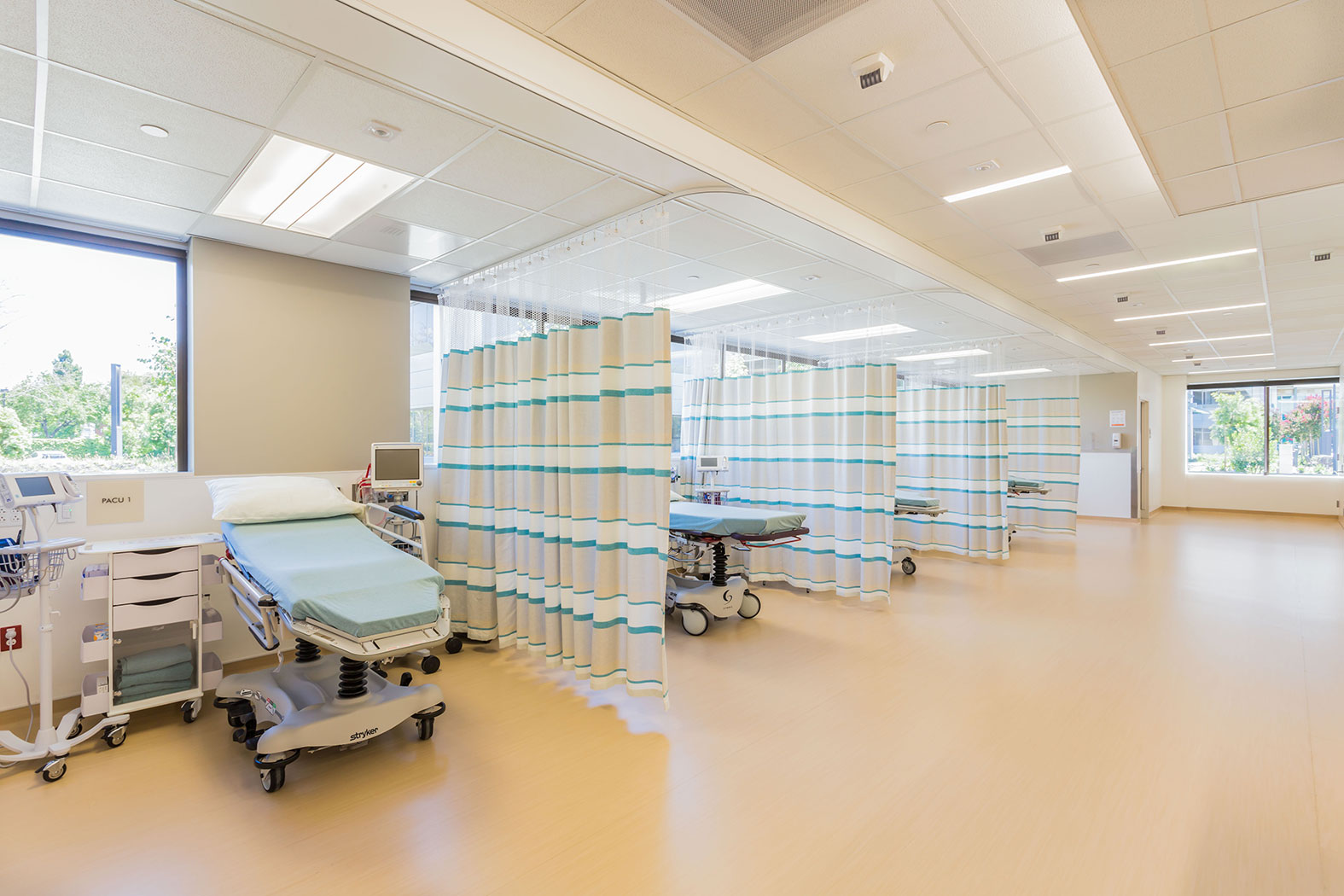
Patients undergoing in vitro fertilization often feel a weight of pressure, which is why the Colorado Center for Reproductive Medicine (CCRM) focuses so much on designs that will help to put patients at ease. That strategy has become even more important as CCRM expands its footprint.
In the last year alone, the growing fertility clinic with nine locations has opened four facilities in major cities around the country: New York City, Boston and San Francisco, along with Vienna, Va. The clinic has worked with Perkins+Will on each of the four projects, and states that there are lessons learned on each site that help to propel the success of the next one.
“We’ve developed a strong set of protocols for the design of these facilities to achieve both the highest level of outcomes and highest level of patient experience,” says Scott Portnoy, vice president of corporate development at CCRM. “Achieving that dichotomy is pretty tough, but working with this process we have been able to do that in each location. And that’s the recipe we need to be successful in serving our patient population.”
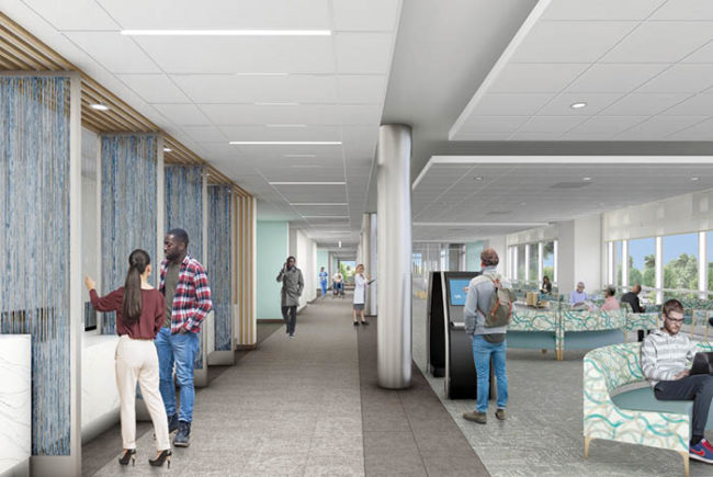
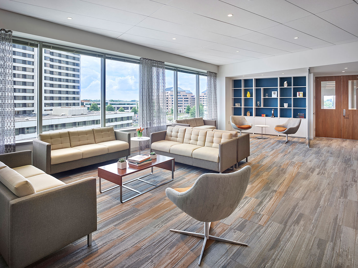
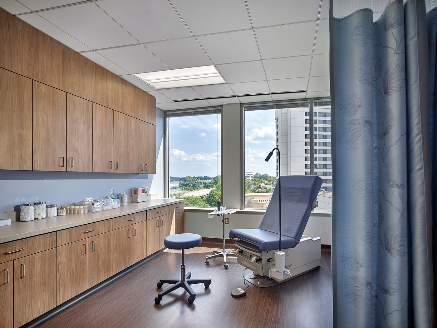
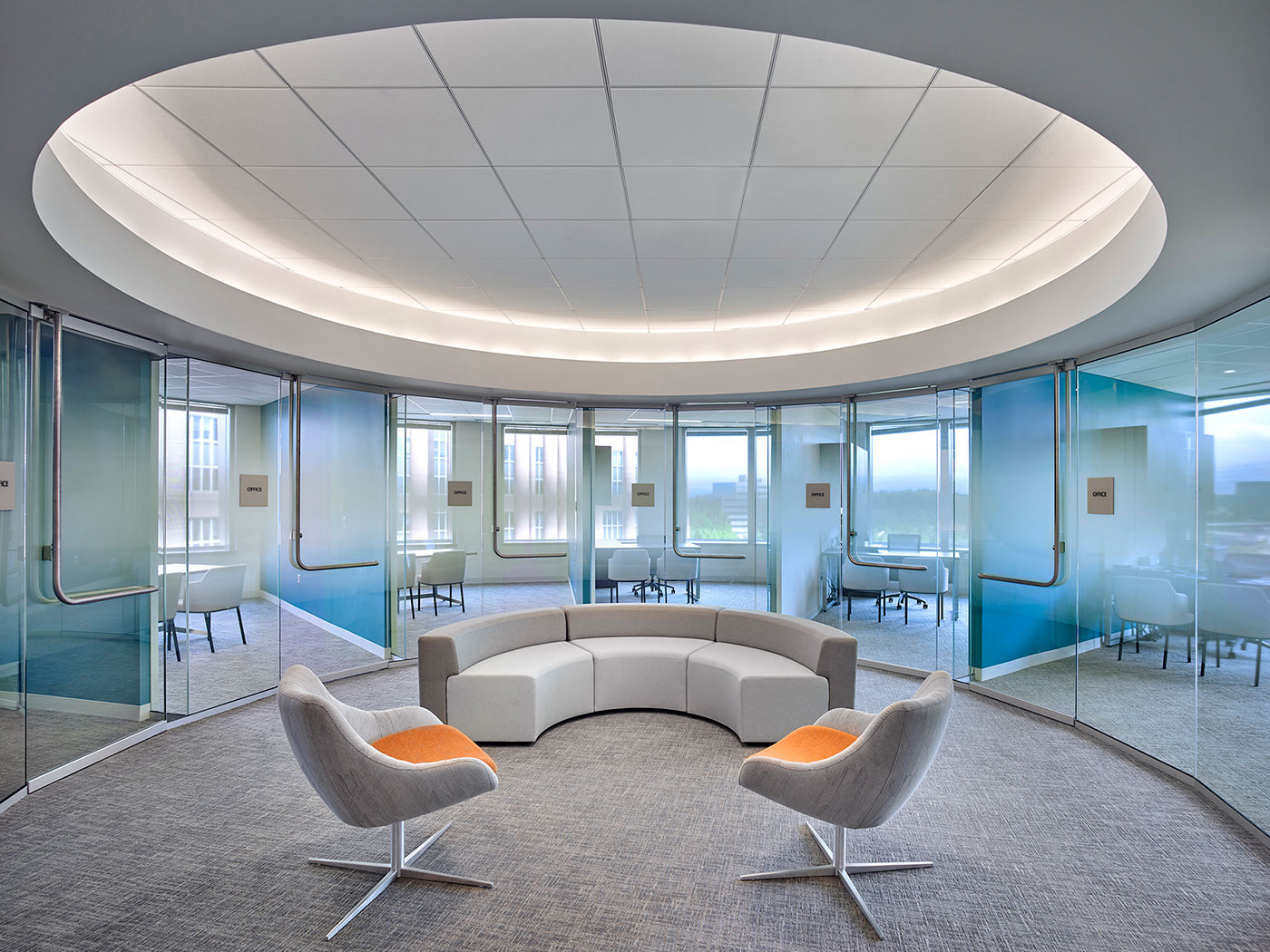
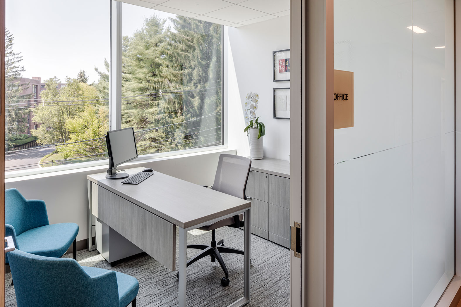
Design features such as intuitive wayfinding so that already stressed patients don’t feel lost, glass doors between waiting areas and clinical areas so that those waiting aren’t afraid of what’s on the other side, and the use of natural materials and palettes that blend rich and cool colors all help to create a calming environment in each facility. However, Ted Shaw, associate principal in Perkins+Will’s New York office, says that while the design objectives are consistent in each location, the translation of those objectives is always appropriate for the individual setting.
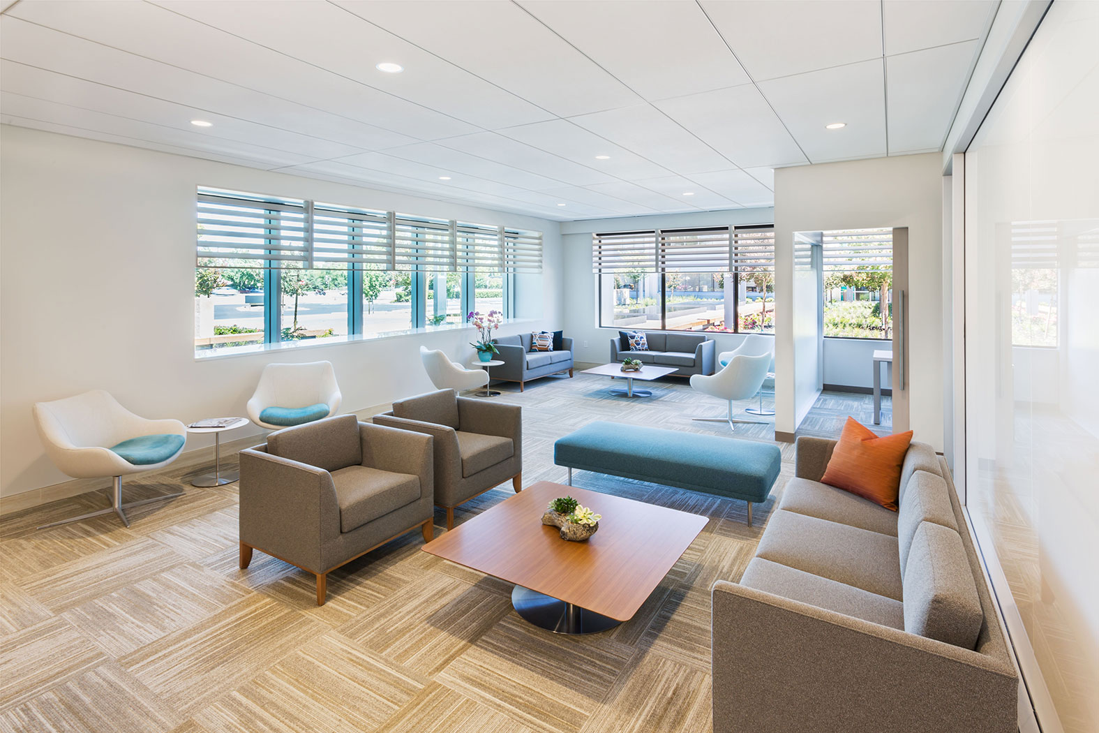
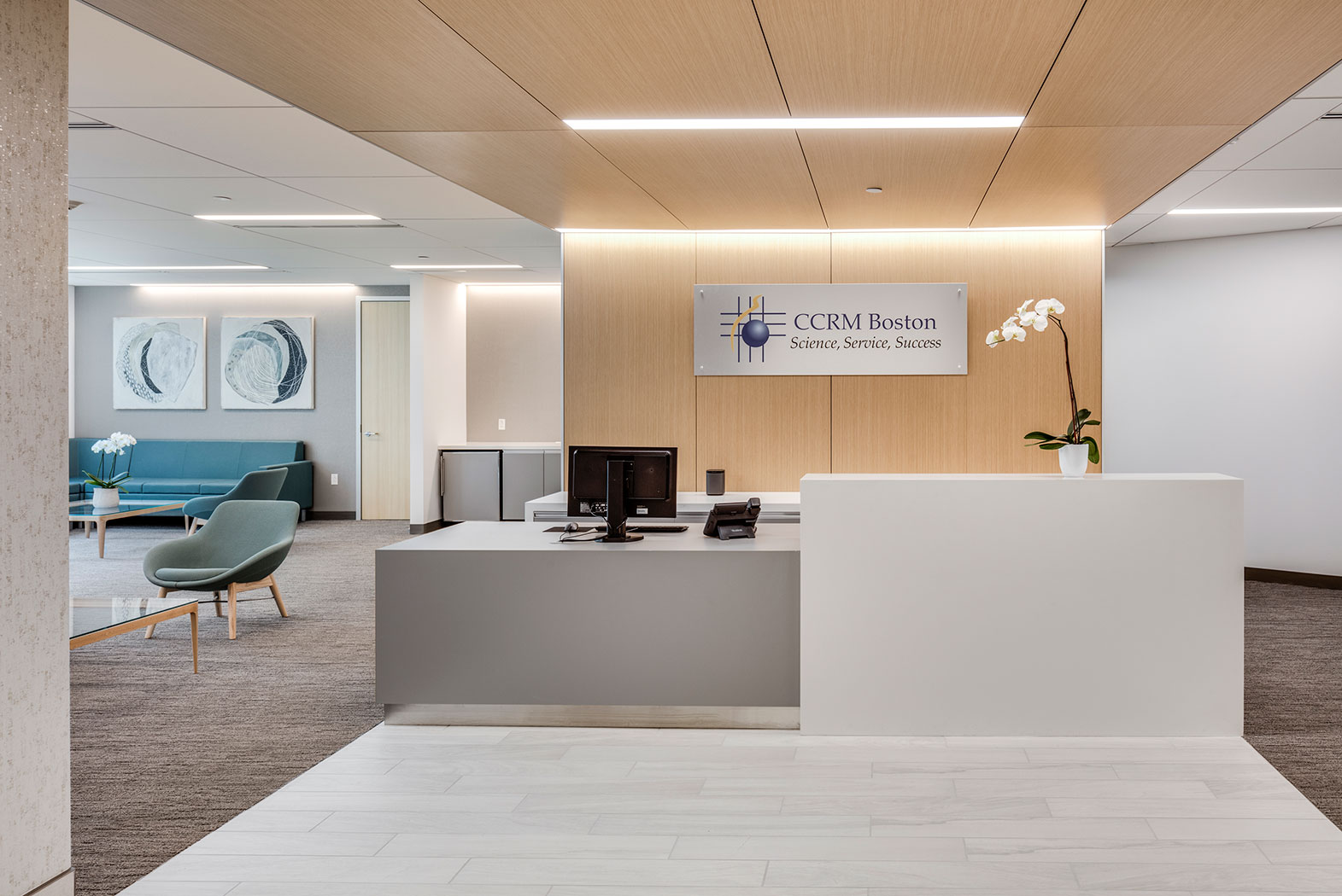
The Virginia facility features clean lines and midcentury modern furniture in the waiting room, and cool blue hues are used throughout clinical areas. The New York location features views of the city skyline and warm, muted tones. In San Francisco, the design team opted for neutral tones with small pops of color in the furniture and other materials. The Boston clinic sets itself apart with patterned carpeting in neutral tones and artwork dotting the facility.
“We wanted to create a better experience and a consistent brand," Shaw says. "But how do we develop design guidelines and brand guidelines that allow us to go into multiple markets? We didn’t want a prototype like McDonald's where every one is the same. We created a palette that was adaptable and would deinstitutionalize the feeling within the spaces. So, we do have differences between Boston and New York. Each one has a level of appropriateness that fits within the locale.”