
New furniture improves waiting room experience
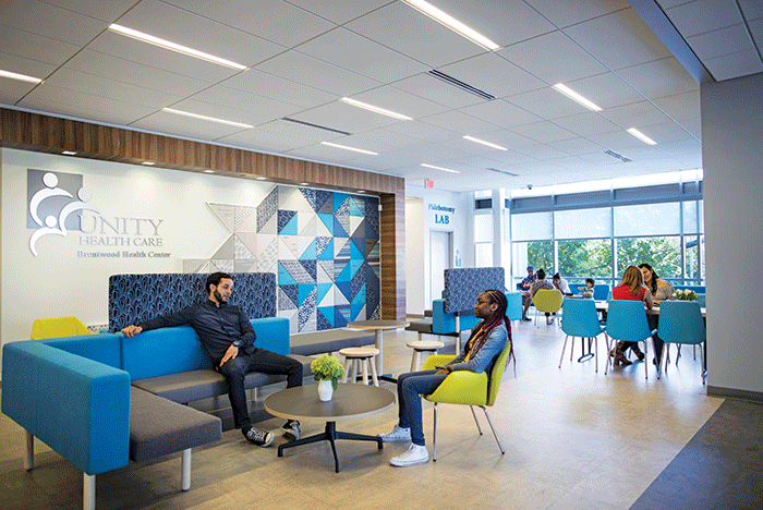
Image courtesy of Unity Health Care Brentwood Health Center
Unity Health Care’s Brentwood Health Center is a patient-centered medical home based in Washington, D.C. The health center is part of a 29-clinic system founded in 1985 as the Healthcare for the Homeless project that has since expanded its reach to include underserved and low-income populations. Its mission is to improve community health by providing accessible, holistic care that addresses the physical, mental and social health of its patients.
On its continual journey to improve patient health, Unity Brentwood decided to research how visitors experienced its waiting room.
When patients arrived at the previous incarnation of the Unity Brentwood waiting area, they were greeted by a space featuring the usual signifiers of health care facilities: chairs upholstered in a vinyl-like material and arranged in a rigid, rectangular layout. Combined with walls largely unadorned and neutral-colored, the environment evoked institutional standardization.
Unity partnered with global design firm Gensler, San Francisco, and fabrics company Sunbrella Contract, Burlington, N.C., which served as a research partner. The three organizations initiated research on the waiting room and registration experience, exploring how to better serve patients and visitors, enhance the staff experience and strengthen bonds with the Brentwood community.
The team’s research included a combination of staff surveys and follow-up discussions, observations such as behavior mapping and patient participation in community engagement events. The studies revealed a few key issues.
“One key finding from the preoccupancy evaluation was that patients struggled to define their personal space in the array of ganged seats and claimed the loveseats or spread their belongings over several seats to compensate,” says Bonny Slater, senior associate at Gensler. “Another key finding was that patients knew each other from the neighborhood and wanted to chat, but the rows of seats didn’t support conversation, so they ended up standing in the lobby.”
A few other issues to address in the design included unclear and confusing signage directing patients to registration, and complaints about waiting times. Following its research, the design team came up with five overarching goals: define personal space, encourage communication among patients, clarify the check-in process, support the check-in process and reflect the Brentwood community.
To achieve its first two goals, Unity Brentwood diversified its furniture selections. Unity selected Toronto-based furniture design company Keilhauer to manufacture the new seating and tables that would fill the space. All woven furniture textiles were created by Sunbrella.
The new seating included adding multiple small clusters of seating, seating at a large communal table, bench seats to support bariatric patients and armchairs to assist older patients. Elements such as screens and movable tables were added to help patients define personal space based on preference.
The new seating resulted in several improvements. The more communal seating arrangements led to a 100% increase in instances of communication among people who did not arrive at the clinic together, allowing neighbors to have conversations inside the facility rather than gathering in the lobby.
Also, families visiting the clinic gravitated to the small clusters of seats facing each other, as the health center intended. The new furniture made it possible to renovate the layout to accommodate seven extra seats, and patients used fewer seats to define personal space. In the previous layout, patients would sit two to three seats apart. The new furniture helped bring that number down to one to two seats.
Another improvement recorded after the furniture changes was a 25% decrease in complaints about wait times, even though there was no change in actual wait times. The design team associates this improvement to better patient experience helped by more comfortable and welcoming seating accompanied by a clear path to registration. The design team reduced visual clutter and replaced numerous confusing signs with a simple station for check-in. HFM